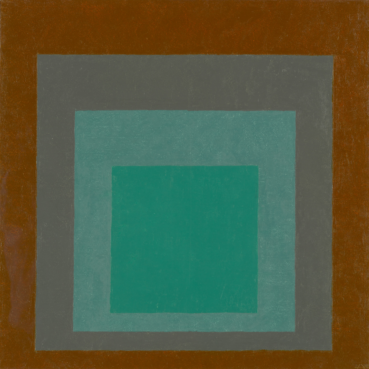
Josef Albers created this painting as part of his Homage to the Square series. The series explores human perceptions of color and how different colors or hues interact with one another. Homage to the Square includes over 1,000 paintings of squares that appear to expand and recede. The simple shapes allow the colors to be the focus of the painting. His “optical illusion” paintings helped influence the optical, or op art, movement. Op artists used geometric shapes, abstract patterns, and contrasting colors to create artworks that trick the eye.
Every perception of colour is an illusion . . . we do not see colors as they really are. In our perception they alter one another.
Josef Albers
His approach to painting was careful and mathematical. Albers applied paints directly from the tube using a palette knife, and he wrote the names of the colors that he used on the backs of his canvases. The paint colors used in this work, from the center square to the outermost square, are Permanent Bright Green (Grumbacher F brand), Cobalt Green Light (Rembrandt brand), Keilly’s Gray (Grumbacher brand), and Golden Ochre (Rhenish brand).
For me, color is the means of my idiom. It’s automatic. I’m not paying “homage to a square.” It’s only the dish I serve my craziness about color on.
Josef Albers
Albers was an influential artist and art teacher. He taught at the Bauhaus, a famous design school in Germany, until the Nazis closed it in 1933. He then sought refuge in the United States and was hired as the first art teacher at Black Mountain College. This liberal arts school near Asheville, North Carolina, emphasized art as an essential part of learning. In 1963 Albers wrote a book titled Interaction of Color. It is still a bestseller that is used in teaching visual arts today.